はじめに
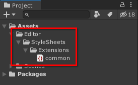
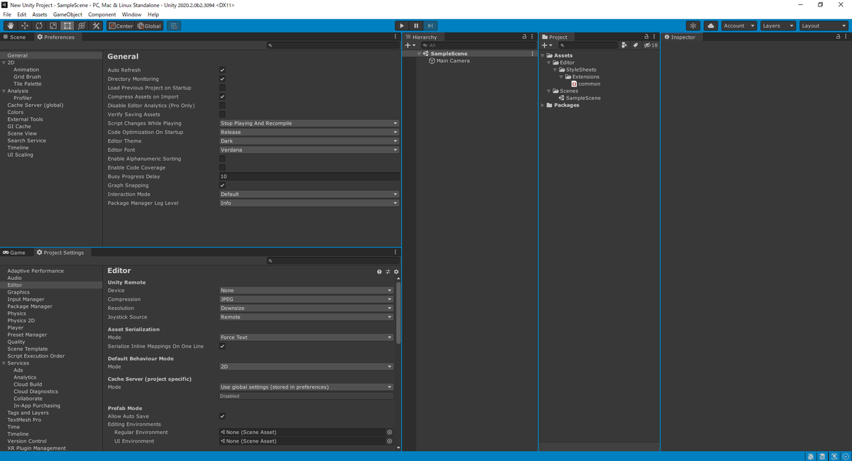
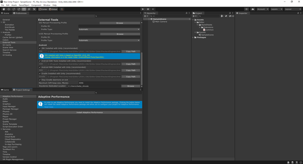
Unity プロジェクトの Assets フォルダに「Editor/StyleSheets/Extensions」フォルダを作って
その中に「common.uss」を追加してコードを記述することで
エディタの UI の色や形を変えられます
:root {
    --unity-metrics-default-border_radius: 12px;
}
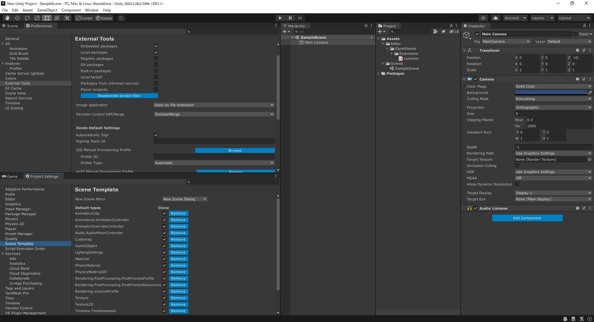
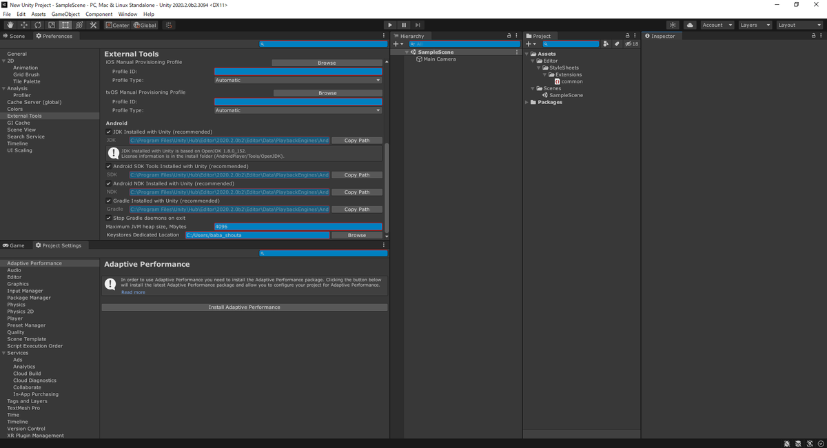
例えば common.uss に上記のコードを記述することで
タブやボタンや入力欄の形が

角丸になります
この記事では common.uss で記述できるコードをいくつか紹介していきます
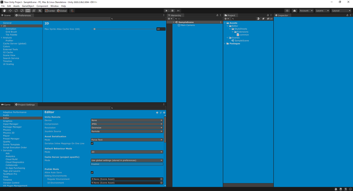
検証環境
- Unity 2020.2.0b2
サンプル
:root {
    --unity-colors-default-text:rgb(0, 128, 192);
}
:root {
    --unity-colors-highlight-background:rgb(0, 128, 192);
    --unity-colors-highlight-background-hover:rgb(0, 128, 192);
    --unity-colors-highlight-background-inactive: rgb(0, 128, 192);
}
:root {
    --unity-colors-app_toolbar-background:  rgb(0, 128, 192);
}
:root {
    --unity-colors-app_toolbar_button-background:  rgb(0, 128, 192);
    --unity-colors-app_toolbar_button-background-hover:  rgb(0, 128, 192);
    --unity-colors-app_toolbar_button-background-checked:  rgb(0, 128, 192);
    --unity-colors-app_toolbar_button-background-pressed:  rgb(0, 128, 192);
}
:root {
    --unity-colors-button-background: rgb(0, 128, 192);
    --unity-colors-button-background-pressed: rgb(0, 128, 192);
    --unity-colors-button-background-focus: rgb(0, 128, 192);
    --unity-colors-button-background-hover: rgb(0, 128, 192);
}
:root {
    --unity-colors-button-border: rgb(0, 128, 192);
    --unity-colors-button-border-pressed: rgb(0, 128, 192);
    --unity-colors-button-border_accent: rgb(0, 128, 192);
}
:root {
    --unity-colors-button-text: rgb(0, 128, 192);
}
:root {
    --unity-colors-dropdown-background: rgb(0, 128, 192);
    --unity-colors-dropdown-background-hover: rgb(0, 128, 192);
}
:root {
    --unity-colors-dropdown-border: rgb(0, 128, 192);
    --unity-colors-dropdown-border_accent: rgb(0, 128, 192);
}
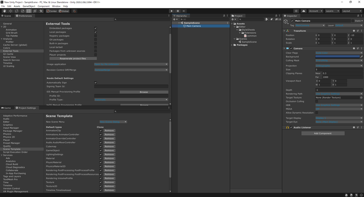
:root {
    --unity-colors-dropdown-text: rgb(0, 128, 192);
}
:root {
    --unity-colors-helpbox-background: rgb(0, 128, 192);
    --unity-colors-helpbox-border: rgb(0, 128, 192);
    --unity-colors-helpbox-text: rgb(255, 255, 0);
}
:root {
    --unity-colors-input_field-background: rgb(0, 128, 192);
    --unity-colors-input_field-border: rgb(255, 0, 0);
    --unity-colors-input_field-border-focus: rgb(255, 0, 0);
    --unity-colors-input_field-border-hover: rgb(255, 0, 0);
    --unity-colors-input_field-border_accent: rgb(255, 0, 0);
}
:root {
    --unity-colors-object_field-background: rgb(0, 128, 192);
    --unity-colors-object_field-border: rgb(255, 0, 0);
    --unity-colors-object_field-border-focus: rgb(255, 0, 0);
    --unity-colors-object_field-border-hover: rgb(255, 0, 0);
}
:root {
    --unity-colors-object_field_button-background: rgb(0, 128, 192);
    --unity-colors-object_field_button-background-hover: rgb(0, 128, 192);
}
:root {
    --unity-colors-preview-background: rgb(0, 128, 192);
    --unity-colors-preview-border: rgb(255, 0, 0);
    --unity-colors-preview-text: rgb(255, 0, 0);
    --unity-colors-preview_overlay-text: rgb(255, 0, 0);
}
:root {
    --unity-colors-scrollbar_groove-background: rgb(0, 128, 192);
    --unity-colors-scrollbar_groove-border: rgb(0, 128, 192);
    --unity-colors-scrollbar_thumb-background: rgb(0, 128, 192);
    --unity-colors-scrollbar_thumb-background-hover: rgb(0, 128, 192);
    --unity-colors-scrollbar_thumb-border: rgb(0, 128, 192);
    --unity-colors-scrollbar_thumb-border-hover: rgb(0, 128, 192);
    --unity-colors-scrollbar_button-background: rgb(0, 128, 192);
    --unity-colors-scrollbar_button-background-hover: rgb(0, 128, 192);
}
:root {
    --unity-colors-slider_groove-background: rgb(0, 128, 192);
    --unity-colors-slider_groove-background-disabled: rgb(0, 128, 192);
    --unity-colors-slider_thumb-background: rgb(0, 128, 192);
    --unity-colors-slider_thumb-background-disabled: rgb(0, 128, 192);
    --unity-colors-slider_thumb-background-hover: rgb(0, 128, 192);
    --unity-colors-slider_thumb-border: rgb(0, 128, 192);
    --unity-colors-slider_thumb-border-disabled: rgb(0, 128, 192);
    --unity-colors-slider_thumb_halo-background: rgb(0, 128, 192);
}
:root {
    --unity-colors-toolbar_button-background: rgb(0, 128, 192);
    --unity-colors-toolbar_button-background-hover: rgb(0, 128, 192);
    --unity-colors-toolbar_button-background-checked: rgb(0, 128, 192);
    --unity-colors-toolbar_button-background-focus: rgb(0, 128, 192);
}
:root {
    --unity-colors-toolbar_button-border: rgb(0, 128, 192);
}
:root {
    --unity-colors-toolbar_button-text: rgb(0, 128, 192);
    --unity-colors-toolbar_button-text-hover: rgb(0, 128, 192);
    --unity-colors-toolbar_button-text-checked: rgb(0, 128, 192);
}
:root {
    --unity-colors-toolbar-background: rgb(0, 128, 192);
    --unity-colors-toolbar-border: rgb(0, 128, 192);
}
:root {
    --unity-colors-tab-background: rgb(0, 128, 192);
    --unity-colors-tab-background-checked: rgb(0, 128, 192);
    --unity-colors-tab-background-hover: rgb(0, 128, 192);
}
:root {
    --unity-colors-window-background: rgb(0, 128, 192);
}
:root {
    --unity-colors-inspector_titlebar-background: rgb(0, 128, 192);
    --unity-colors-inspector_titlebar-background-hover: rgb(0, 128, 192);
}
:root {
    --unity-colors-inspector_titlebar-border: rgb(0, 128, 192);
    --unity-colors-inspector_titlebar-border_accent: rgb(0, 128, 192);
}
:root {
    --unity-theme-background-color-1: rgb(0, 128, 192);
    --unity-theme-background-color-2: rgb(0, 128, 192);
    --unity-theme-background-color-3: rgb(0, 128, 192);
    --unity-theme-background-color-4: rgb(0, 128, 192);
    --unity-theme-background-color-5: rgb(0, 128, 192);
    --unity-theme-background-color-6: rgb(0, 128, 192);
    --unity-theme-background-color-7: rgb(0, 128, 192);
    --unity-theme-background-color-8: rgb(0, 128, 192);
    --unity-theme-background-color-9: rgb(0, 128, 192);
    --unity-theme-background-color-10: rgb(0, 128, 192);
    --unity-theme-background-color-11: rgb(0, 128, 192);
    --unity-theme-background-color-12: rgb(0, 128, 192);
    --unity-theme-background-color-13: rgb(0, 128, 192);
    --unity-theme-background-color-14: rgb(0, 128, 192);
    --unity-theme-background-color-15: rgb(0, 128, 192);
    --unity-theme-background-color-16: rgb(0, 128, 192);
    --unity-theme-background-color-17: rgb(0, 128, 192);
    --unity-theme-background-color-50: rgb(0, 128, 192);
    --unity-theme-background-color-51: rgb(0, 128, 192);
    --unity-theme-background-color-52: rgb(0, 128, 192);
    --unity-theme-background-color-53: rgb(0, 128, 192);
    --unity-theme-background-color-54: rgb(0, 128, 192);
    --unity-theme-background-color-55: rgb(0, 128, 192);
    --unity-theme-background-color-56: rgb(0, 128, 192);
    --unity-theme-background-color-57: rgb(0, 128, 192);
    --unity-theme-background-color-58: rgb(0, 128, 192);
    --unity-theme-background-color-59: rgb(0, 128, 192);
    --unity-theme-background-color-60: rgb(0, 128, 192);
    --unity-theme-background-color-80: rgb(0, 128, 192);
    --unity-theme-background-color-81: rgb(0, 128, 192);
    --unity-theme-background-color-82: rgb(0, 128, 192);
    --unity-theme-background-color-83: rgb(0, 128, 192);
    --unity-theme-background-color-84: rgb(0, 128, 192);
    --unity-theme-background-color-85: rgb(0, 128, 192);
    --unity-theme-background-color-86: rgb(0, 128, 192);
    --unity-theme-background-color-87: rgb(0, 128, 192);
    --unity-theme-background-color-88: rgb(0, 128, 192);
    --unity-theme-background-color-89: rgb(0, 128, 192);
    --unity-theme-background-color-90: rgb(0, 128, 192);
    --unity-theme-border-color-1: rgb(0, 128, 192);
    --unity-theme-border-color-2: rgb(0, 128, 192);
    --unity-theme-border-color-3: rgb(0, 128, 192);
    --unity-theme-border-color-4: rgb(0, 128, 192);
    --unity-theme-border-color-5: rgb(0, 128, 192);
    --unity-theme-border-color-6: rgb(0, 128, 192);
    --unity-theme-border-color-7: rgb(0, 128, 192);
    --unity-theme-border-color-8: rgb(0, 128, 192);
    --unity-theme-border-color-9: rgb(0, 128, 192);
    --unity-theme-border-color-10: rgb(0, 128, 192);
    --unity-theme-border-color-11: rgb(0, 128, 192);
    --unity-theme-border-color-12: rgb(0, 128, 192);
    --unity-theme-border-color-13: rgb(0, 128, 192);
    --unity-theme-border-color-14: rgb(0, 128, 192);
    --unity-theme-border-color-15: rgb(0, 128, 192);
    --unity-theme-border-color-16: rgb(0, 128, 192);
    --unity-theme-border-color-17: rgb(0, 128, 192);
    --unity-theme-border-color-18: rgb(0, 128, 192);
    --unity-theme-border-color-19: rgb(0, 128, 192);
    --unity-theme-border-color-20: rgb(0, 128, 192);
    --unity-theme-border-color-21: rgb(0, 128, 192);
    --unity-theme-border-color-22: rgb(0, 128, 192);
    --unity-theme-text-color-1: rgb(0, 128, 192);
    --unity-theme-text-color-2: rgb(0, 128, 192);
    --unity-theme-text-color-3: rgb(0, 128, 192);
    --unity-theme-text-color-4: rgb(0, 128, 192);
    --unity-theme-text-color-5: rgb(0, 128, 192);
    --unity-theme-text-color-6: rgb(0, 128, 192);
    --unity-theme-text-color-7: rgb(0, 128, 192);
    --unity-theme-text-color-8: rgb(0, 128, 192);
    --unity-theme-text-color-9: rgb(0, 128, 192);
    --unity-theme-text-color-10: rgb(0, 128, 192);
    --unity-theme-text-color-11: rgb(0, 128, 192);
    --unity-theme-text-color-12: rgb(0, 128, 192);
    --unity-theme-text-color-13: rgb(0, 128, 192);
}
:root {
    --unity-metrics-toolbar-height: 100px;
}
備考
Unity 2020.2.0b2 の時点で使われている .uss は上記のリポジトリにアップしております